Facebook

North Carolina Azalea Festival

North Carolina Azalea Festival

A refreshed brand identity for a Wilmington tradition, ahead of its 80th Festival.
Springer

Listening Before We Drew a Line

Since 1948, the North Carolina Azalea Festival has been a Wilmington tradition, and the people who run it know it best. Before we drew anything, we sat down with staff, board members and past presidents, and we went back through generations of festival programs, queens and memories. Three ideas kept coming up: joyful tradition, botanical energy and community warmth. Those three principles guided every decision that followed, from the crest to the color palette.
No items found.

A Crest Rooted in the Garden

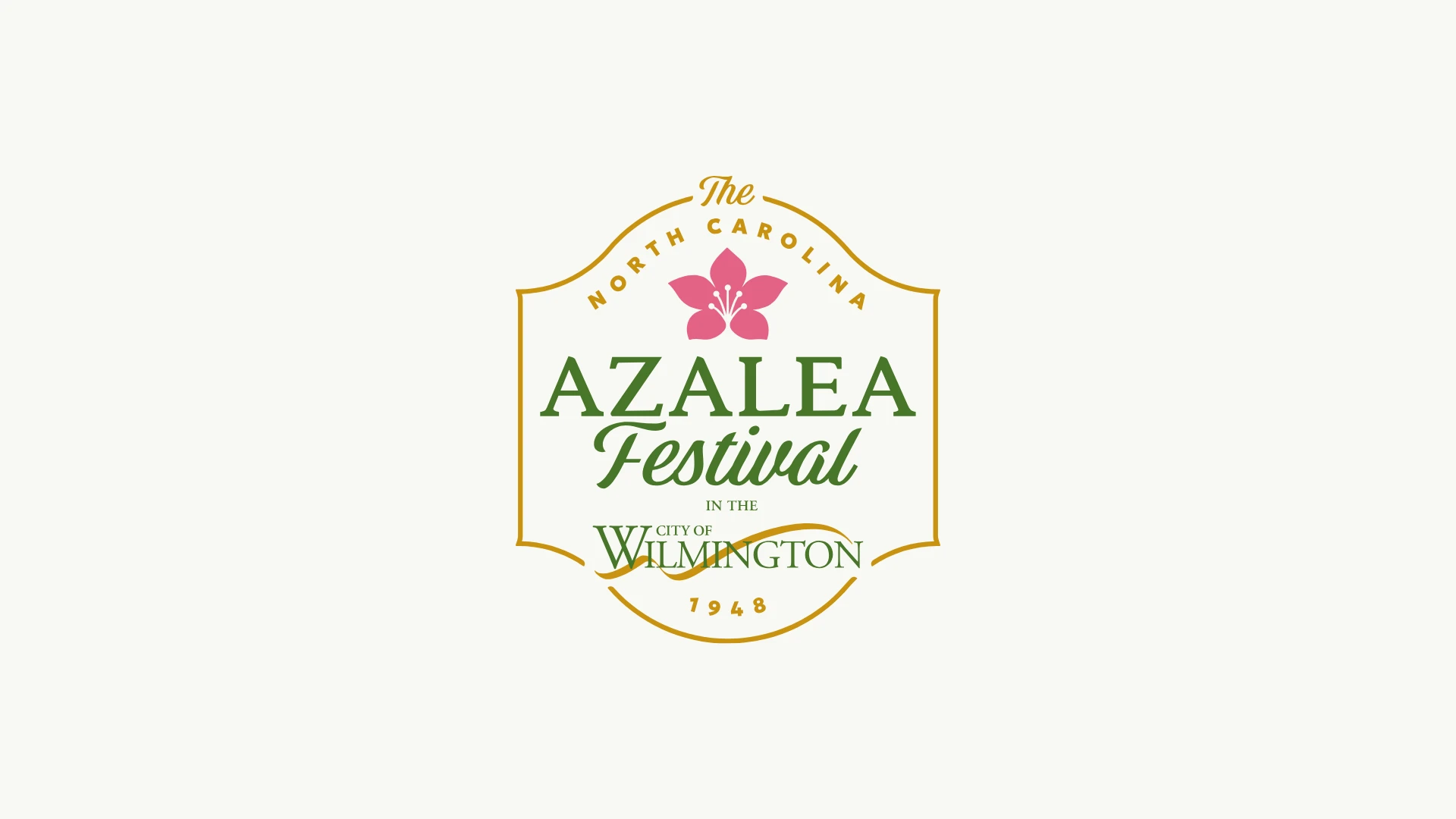
Every year brought new festival art, and that's part of the joy. What the Festival needed was one thread to tie every year together. The new crest puts a blooming azalea at its center for renewal and celebration, frames it with a graceful border that echoes a garden archway, and uses classic lettering that honors the Festival's heritage. Lively color and movement keep it welcoming for each new generation, and an animated version brings the crest to life on screen.
No items found.

A Family of Marks for Every Use

The crest leads, but it can't do every job. A family of secondary marks carries the identity where the full crest would be too formal or too detailed: merchandise, social media, signage and small spaces. Familiar elements, from the signature lettering to the azalea bloom, adapt easily to every format and audience. Three of the marks animate, so the family works in motion on a screen as well as on a ball cap.
No items found.

Color, Type and Pattern with Meaning

The palette's meanings came from the Festival's own board: Azalea Pink for the bloom where it all started, Festival Green for its leaves, Harbor Navy for the water, and Celebration Gold for sun, sand and a golden legacy, with Garden Ivory giving them room. Three typefaces give the brand three voices: Quincy CF for heritage, Geologica for clarity and Storia for celebration. Patterns built from the floral icon bring rhythm and movement to backgrounds, merchandise and environmental graphics.
No items found.

From Street Banners to Every Screen

An identity only works if it holds together everywhere people meet it. We designed the brand across street banners, flags, totes, tees, caps, mugs, buttons, credentials and stationery, then onto social posts, stories and event tickets, so every piece reads as part of the same celebration. For the 80th Festival, we created an anniversary seal, and we unveiled the full identity on stage at the Festival 80 kickoff at Cinespace Studios in October 2026.
North Carolina Azalea Festival Logo Design
No items found.

A new thread for a cherished tradition.

The North Carolina Azalea Festival has been a Wilmington tradition since 1948, and every year has brought new festival art. Ahead of its 80th, the Festival came to us to refresh its identity with one thread that ties every year together, without losing what makes it loved. We started by listening to the people who know it best, then built a complete identity system: a new crest, a family of secondary marks, a color palette with meanings from the board, typography, patterns and photography direction, applied to everything from merchandise and signage to social media. We also designed the presentation that revealed the brand at the Festival 80 kickoff. The Festival's visual identity guidelines are being documented now.

The North Carolina Azalea Festival has been a Wilmington tradition since 1948, and every year has brought new festival art. Ahead of its 80th, the Festival came to us to refresh its identity with one thread that ties every year together, without losing what makes it loved. We started by listening to the people who know it best, then built a complete identity system: a new crest, a family of secondary marks, a color palette with meanings from the board, typography, patterns and photography direction, applied to everything from merchandise and signage to social media. We also designed the presentation that revealed the brand at the Festival 80 kickoff. The Festival's visual identity guidelines are being documented now.

Springer